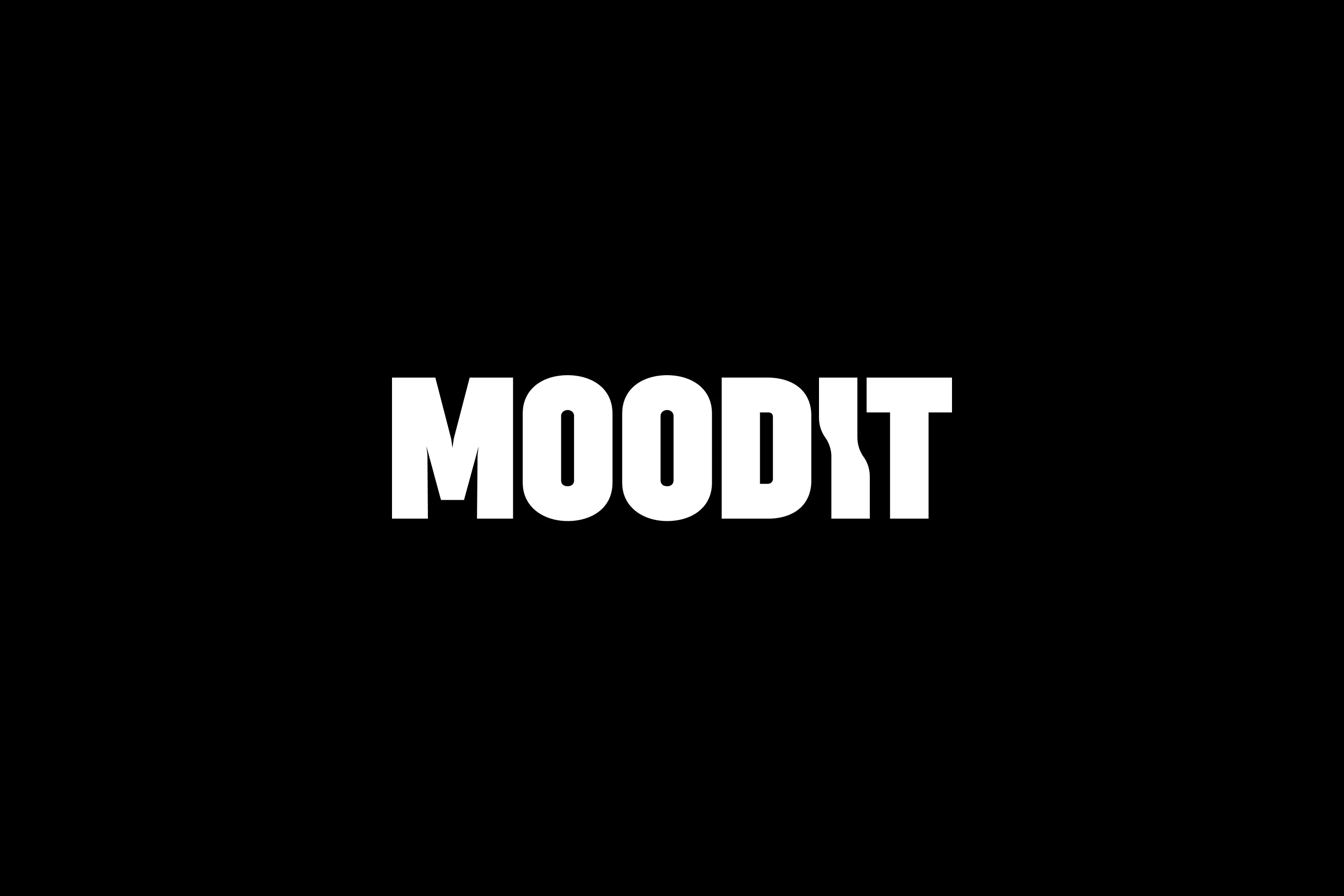
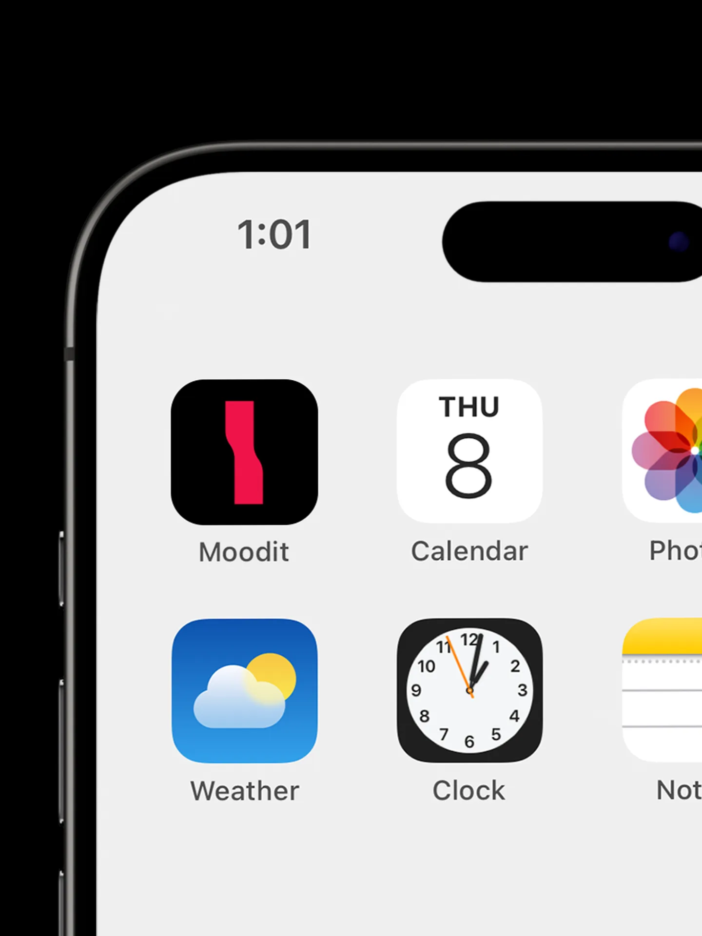
Moodit
Brand Identity Development
Brand identity and kiosk UI design for new photo studios that provide unrealistic and unique production through light.
빛을 통해 비현실적이고 유니크한 연출을 제공하는 새로운 포토스튜디오의 브랜드 아이덴티티 구축 및 키오스크 UI 디자인
- What We Did
- Design Guideline
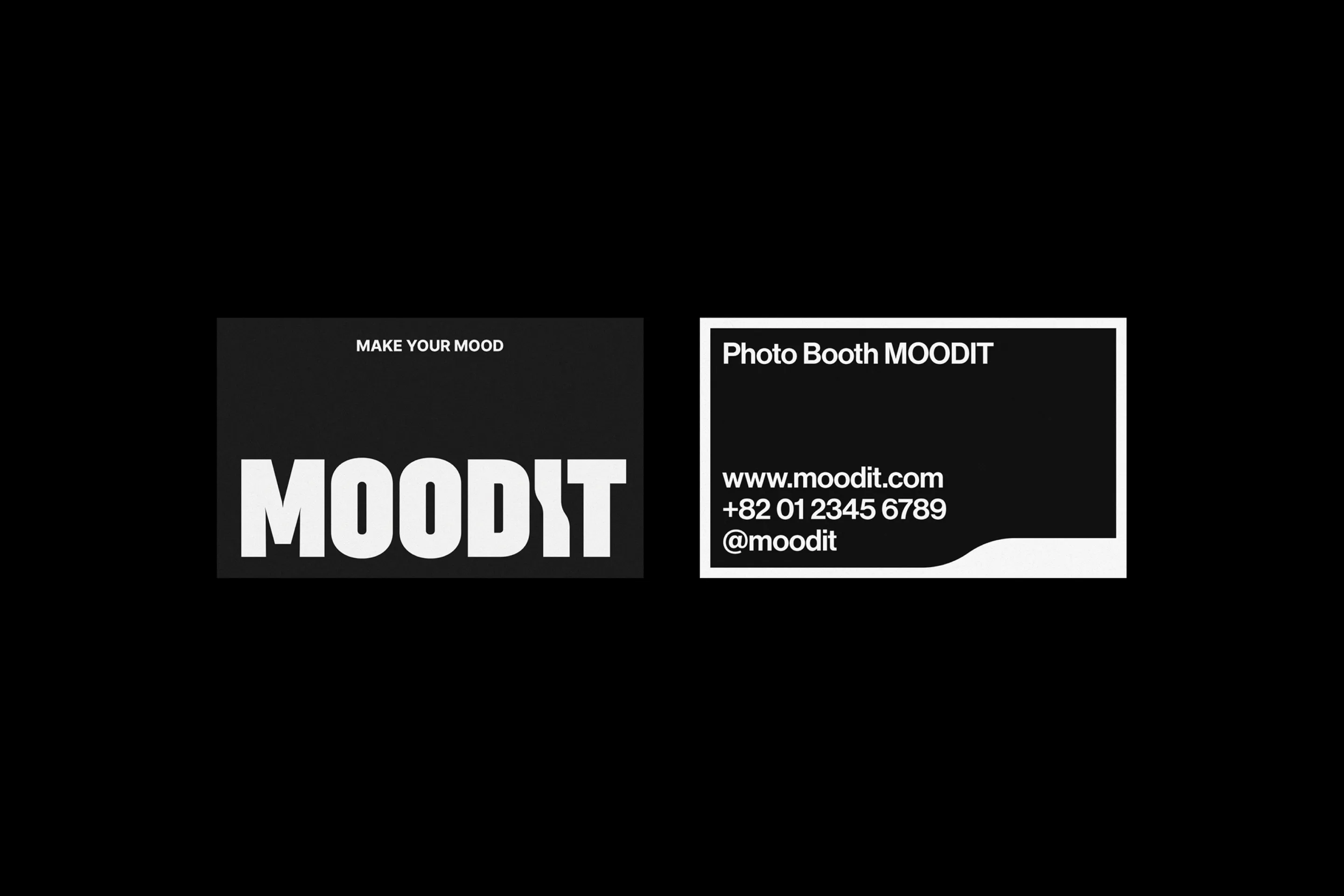
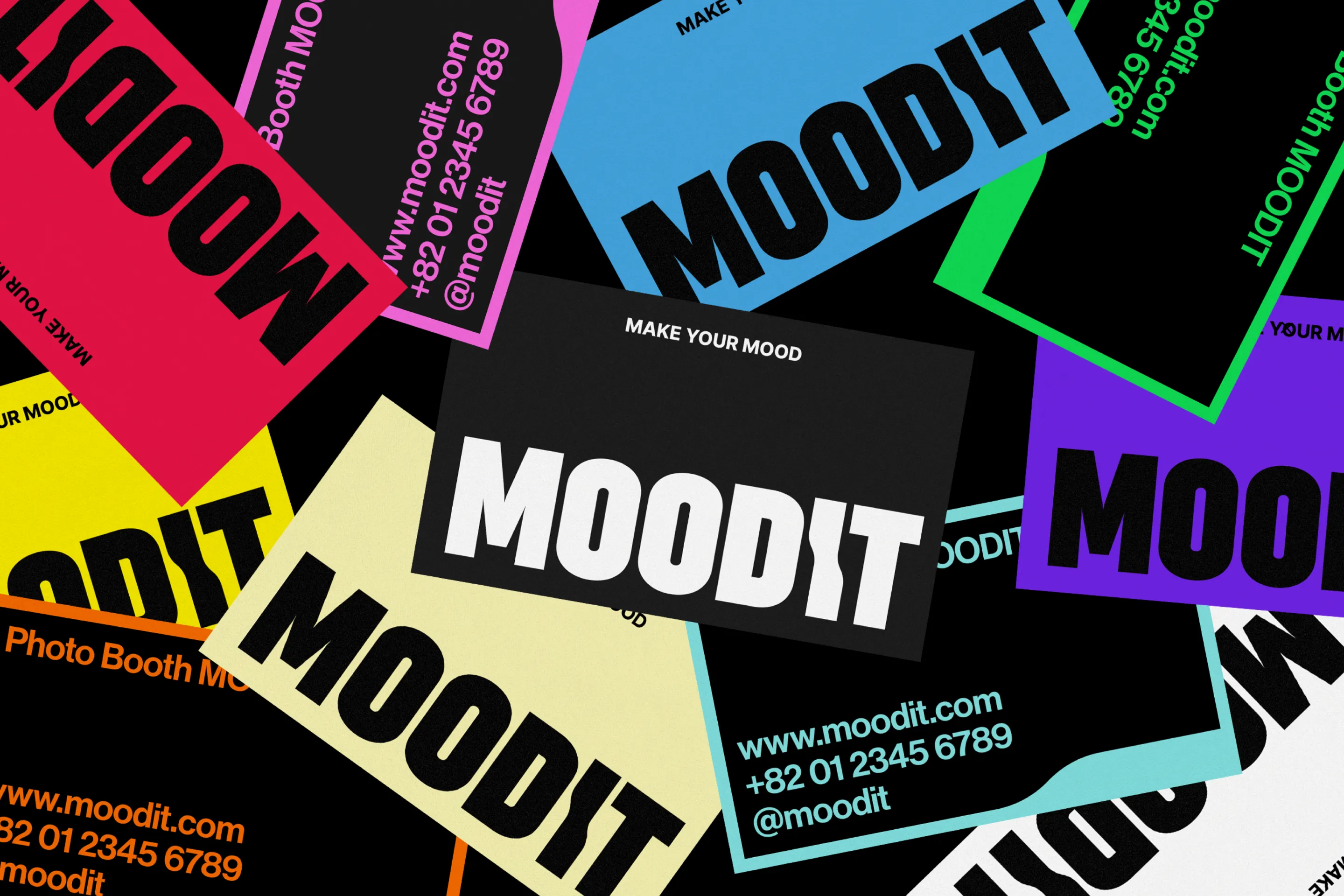
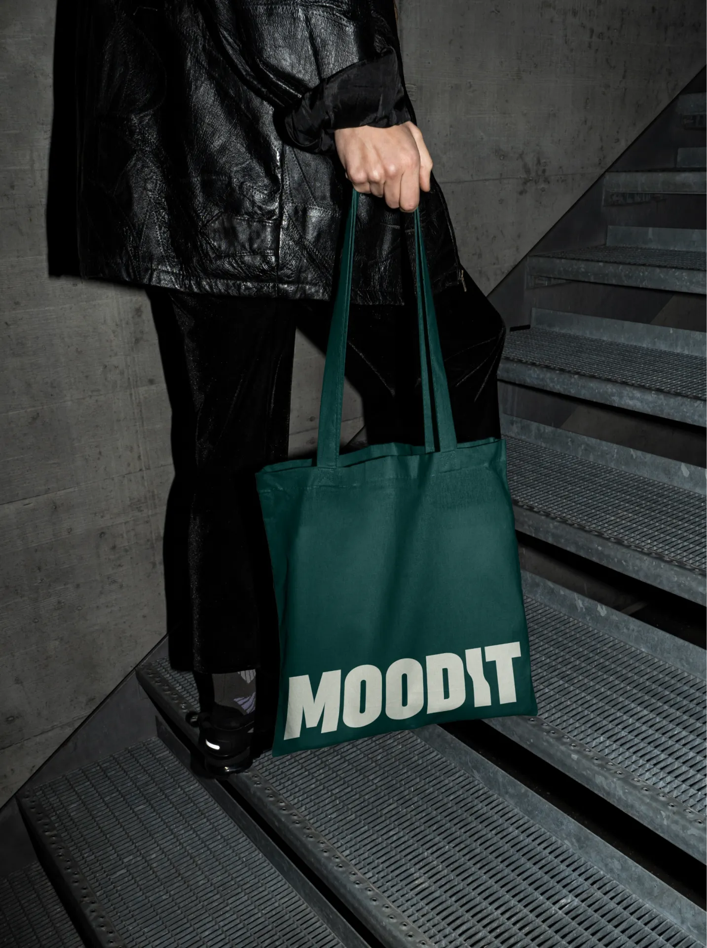
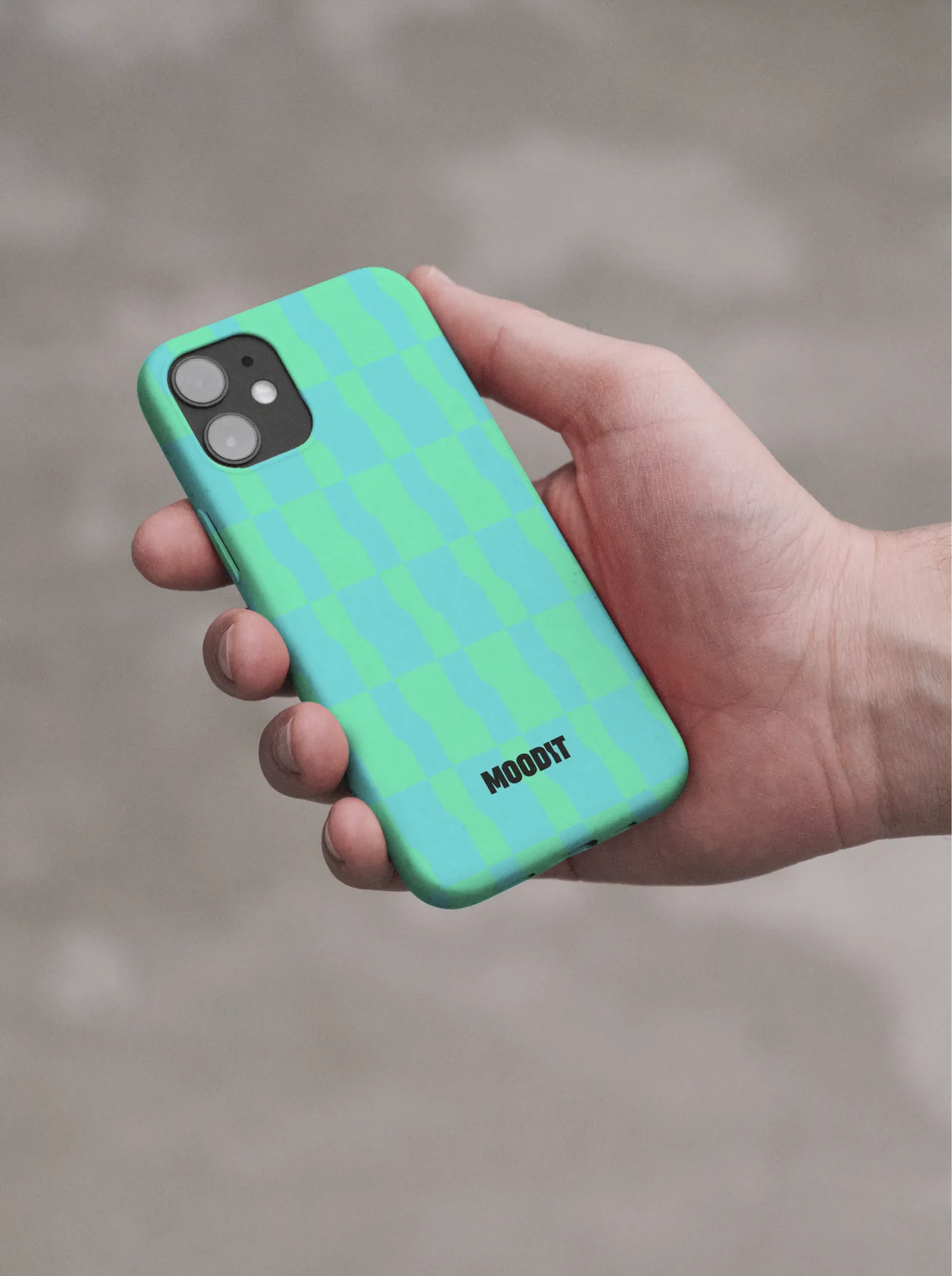
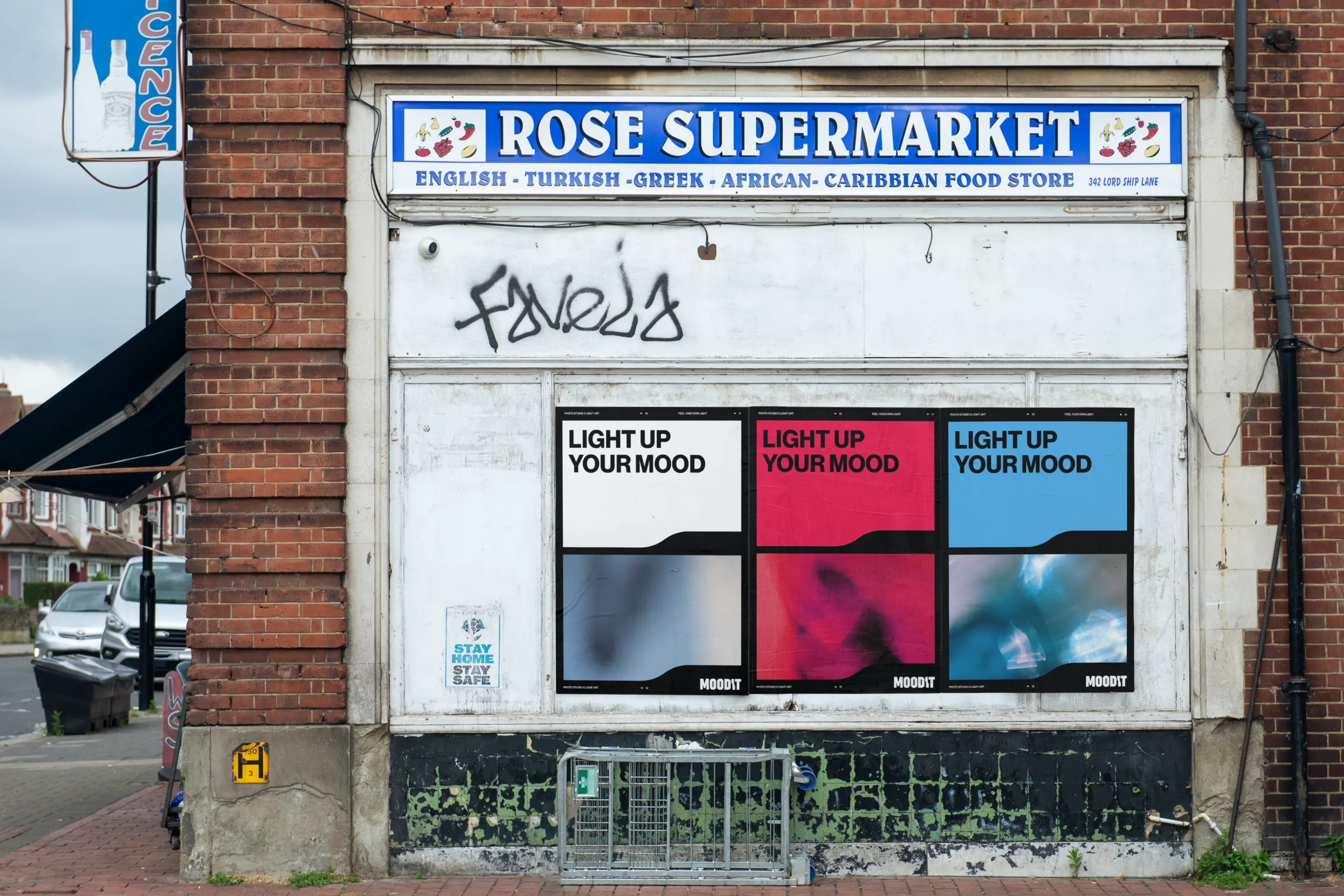
- Brand Application
- Brand Identity
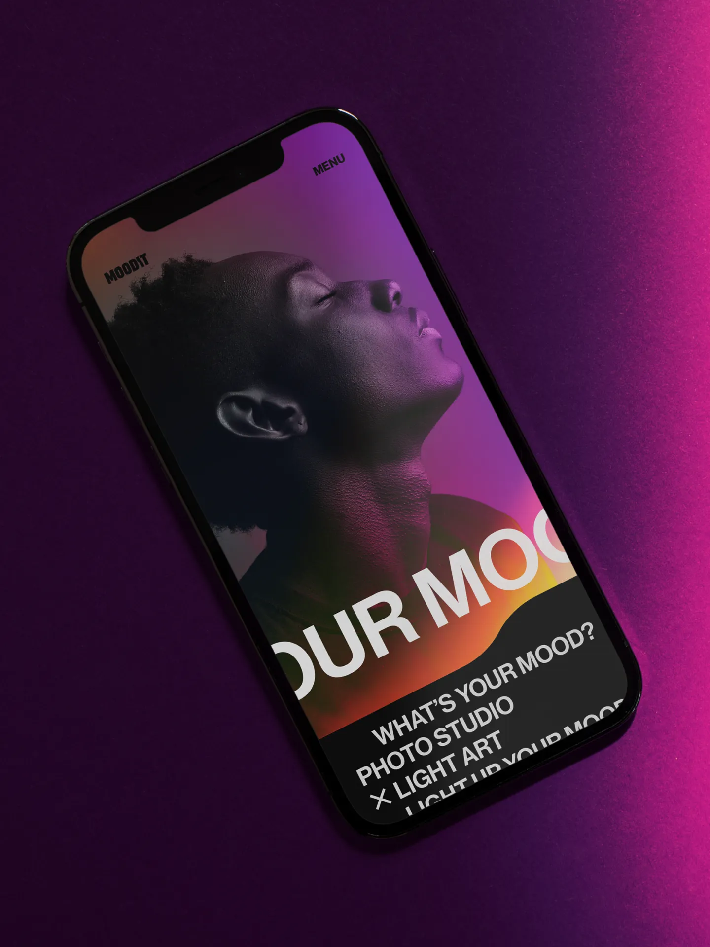
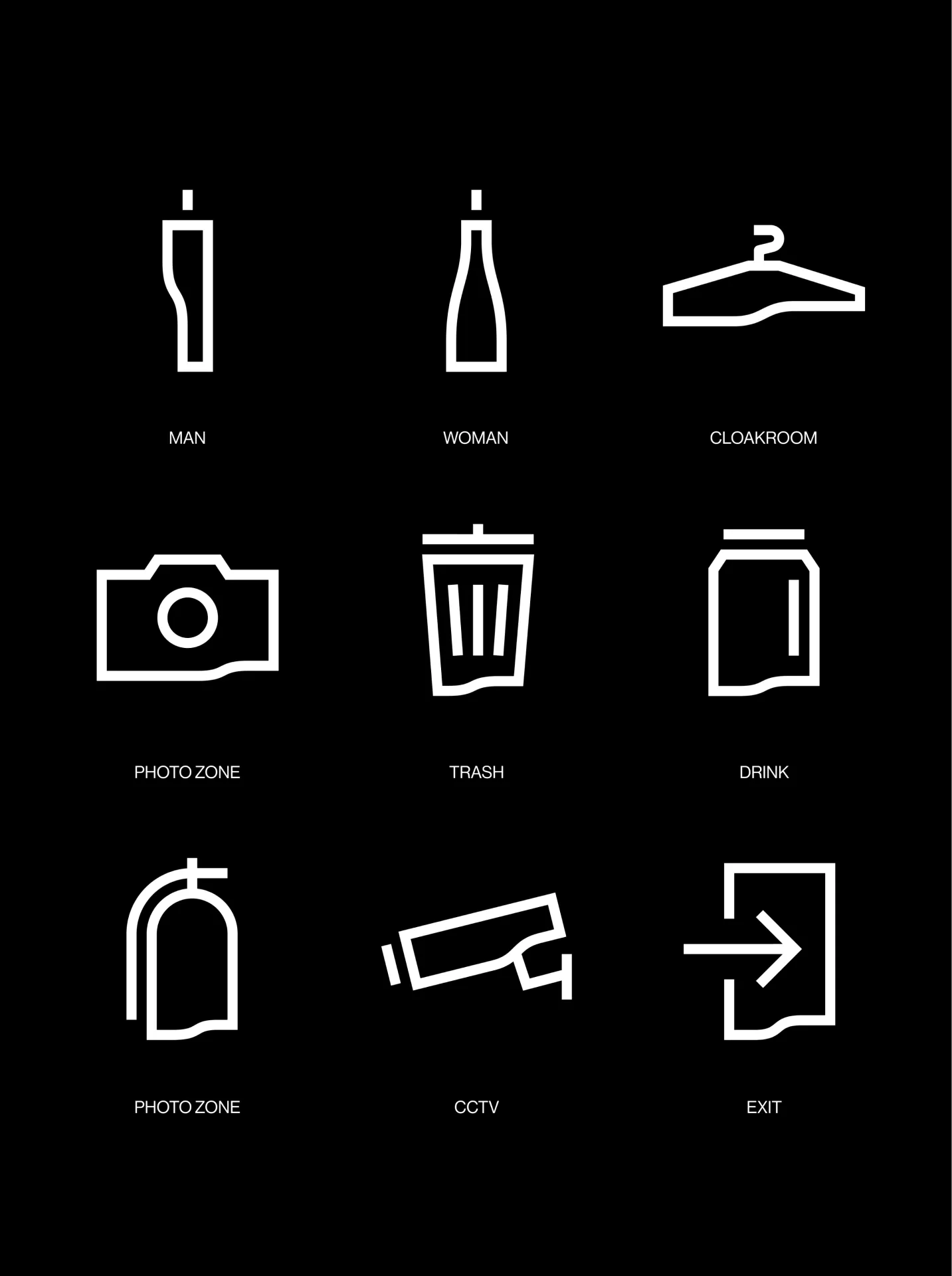
- UI/UX Design
-
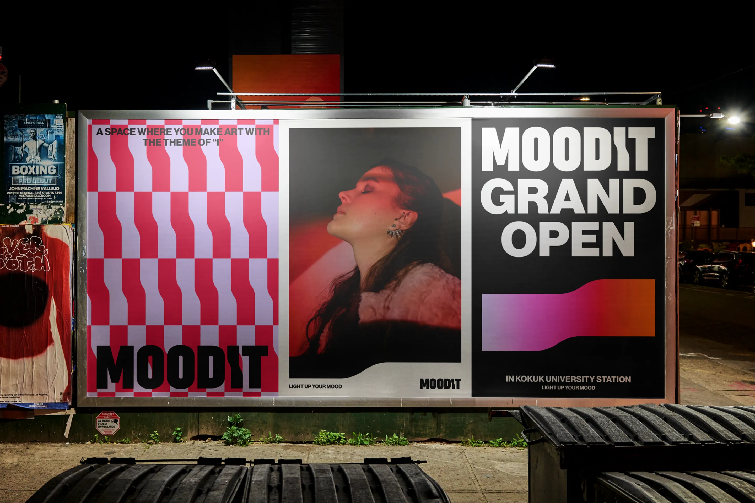
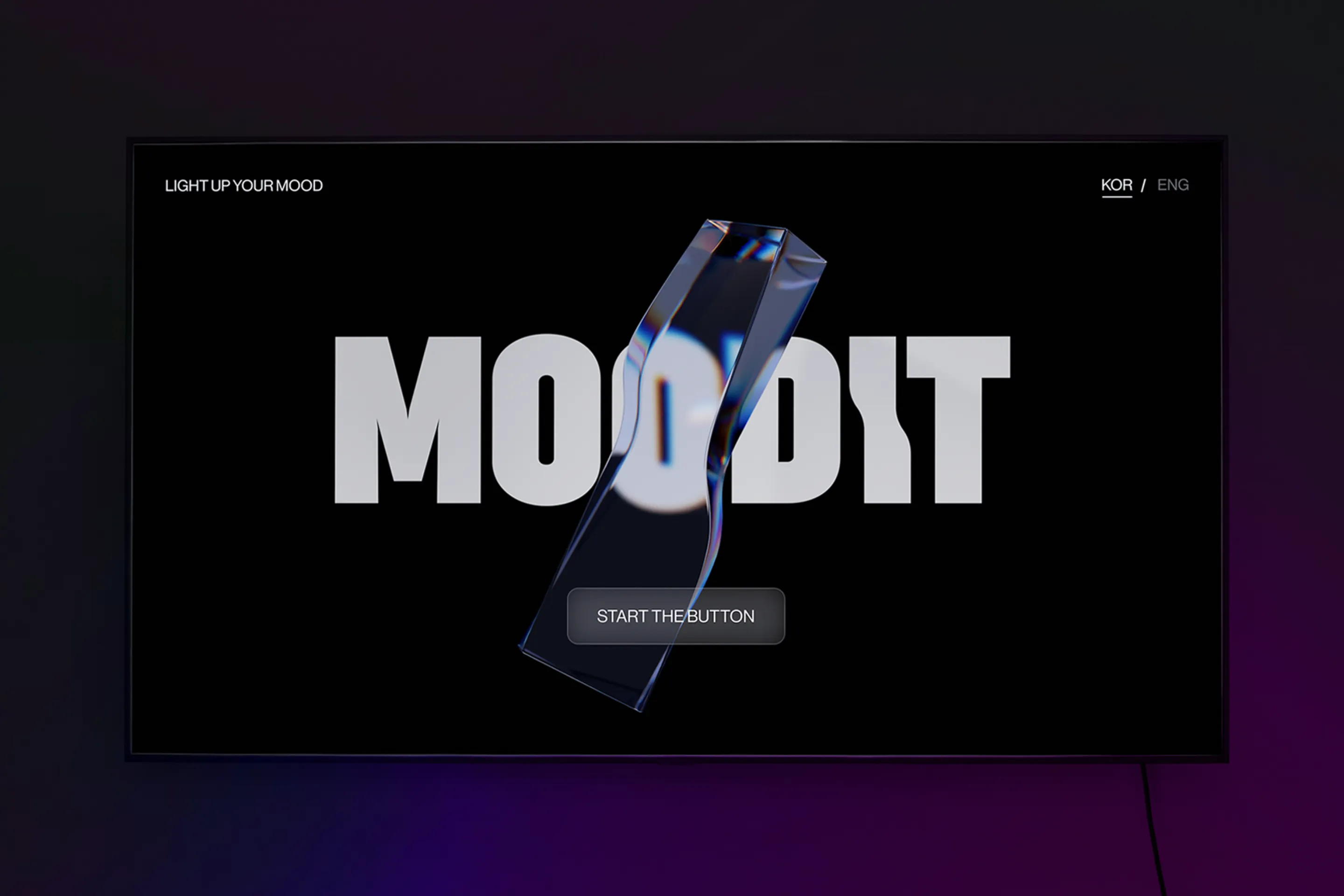
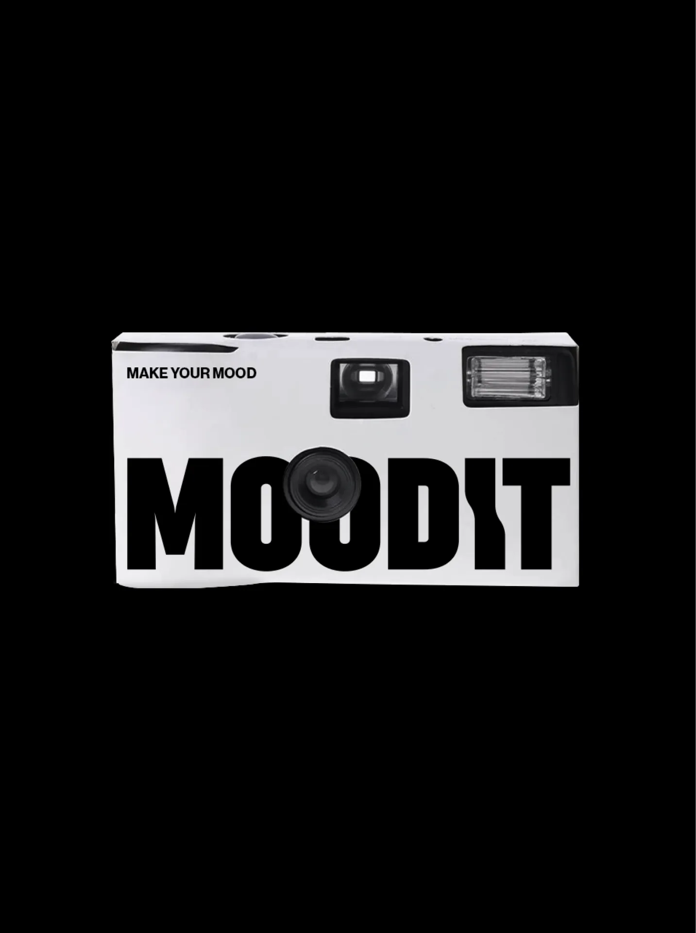
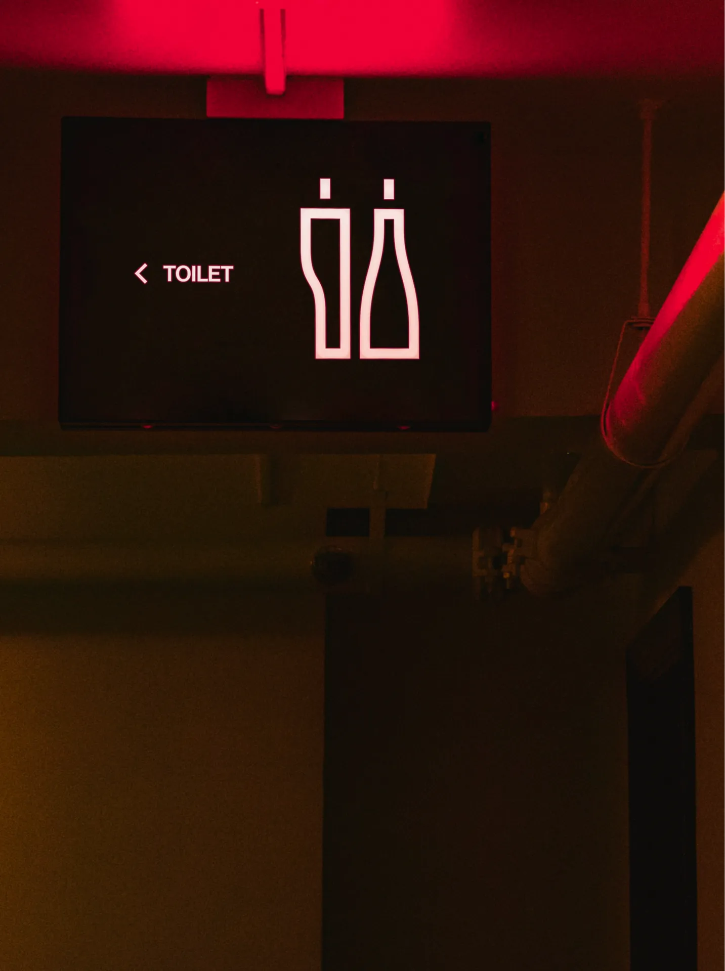
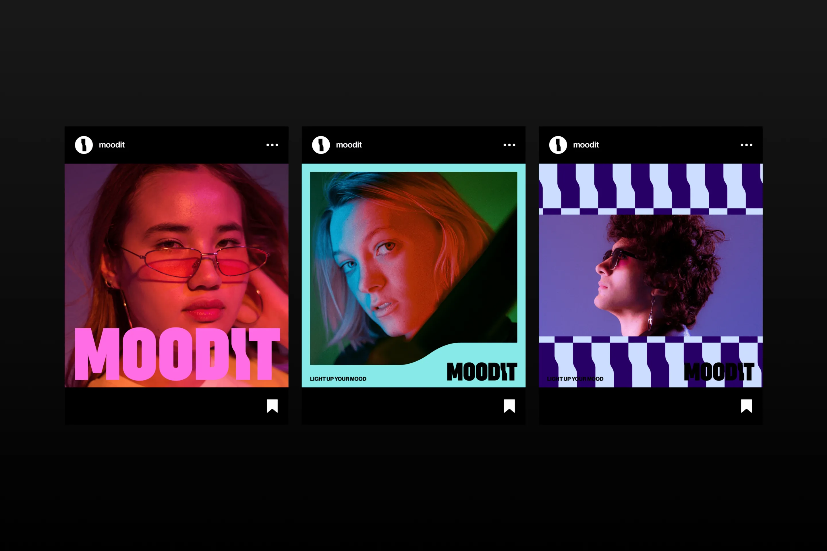
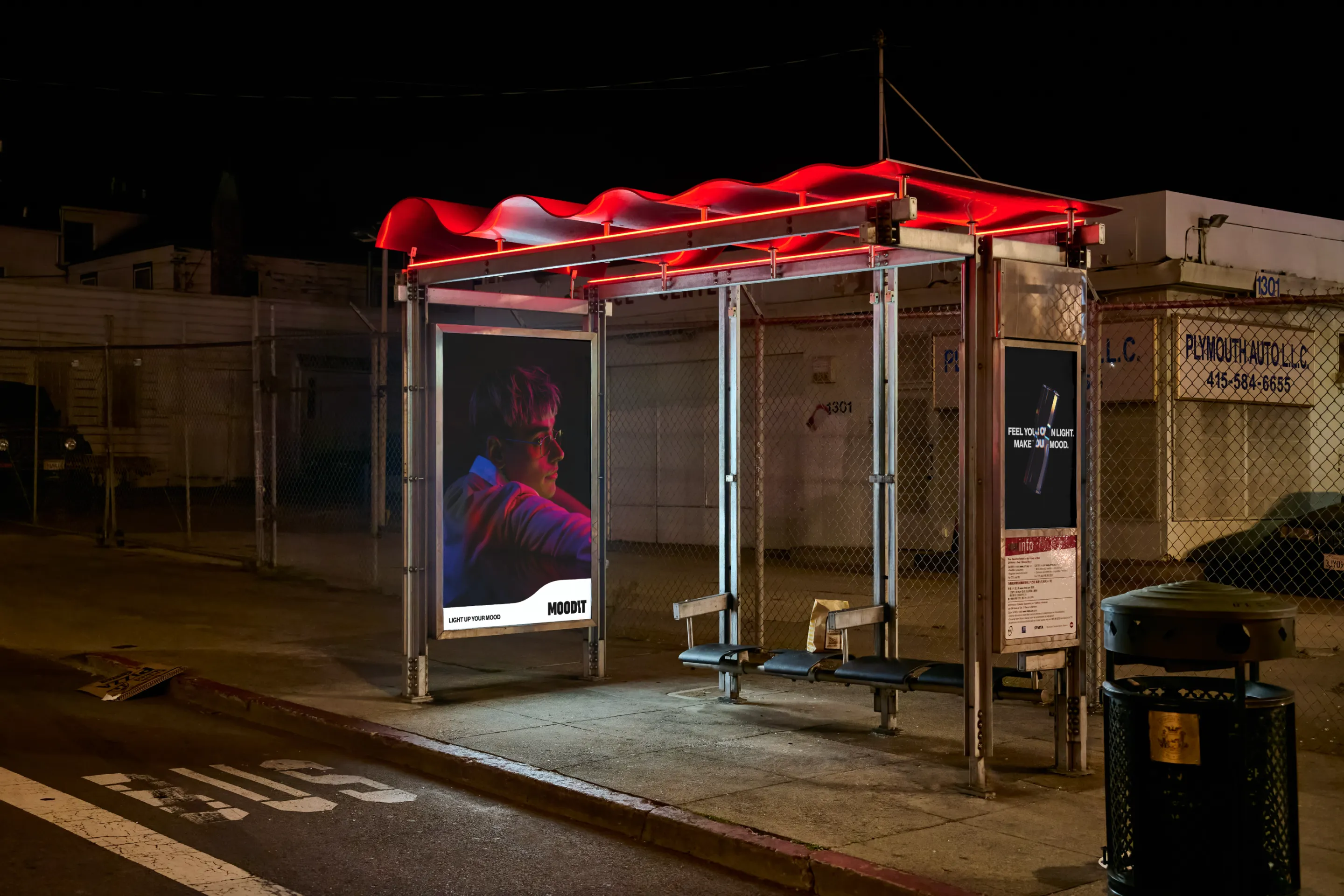
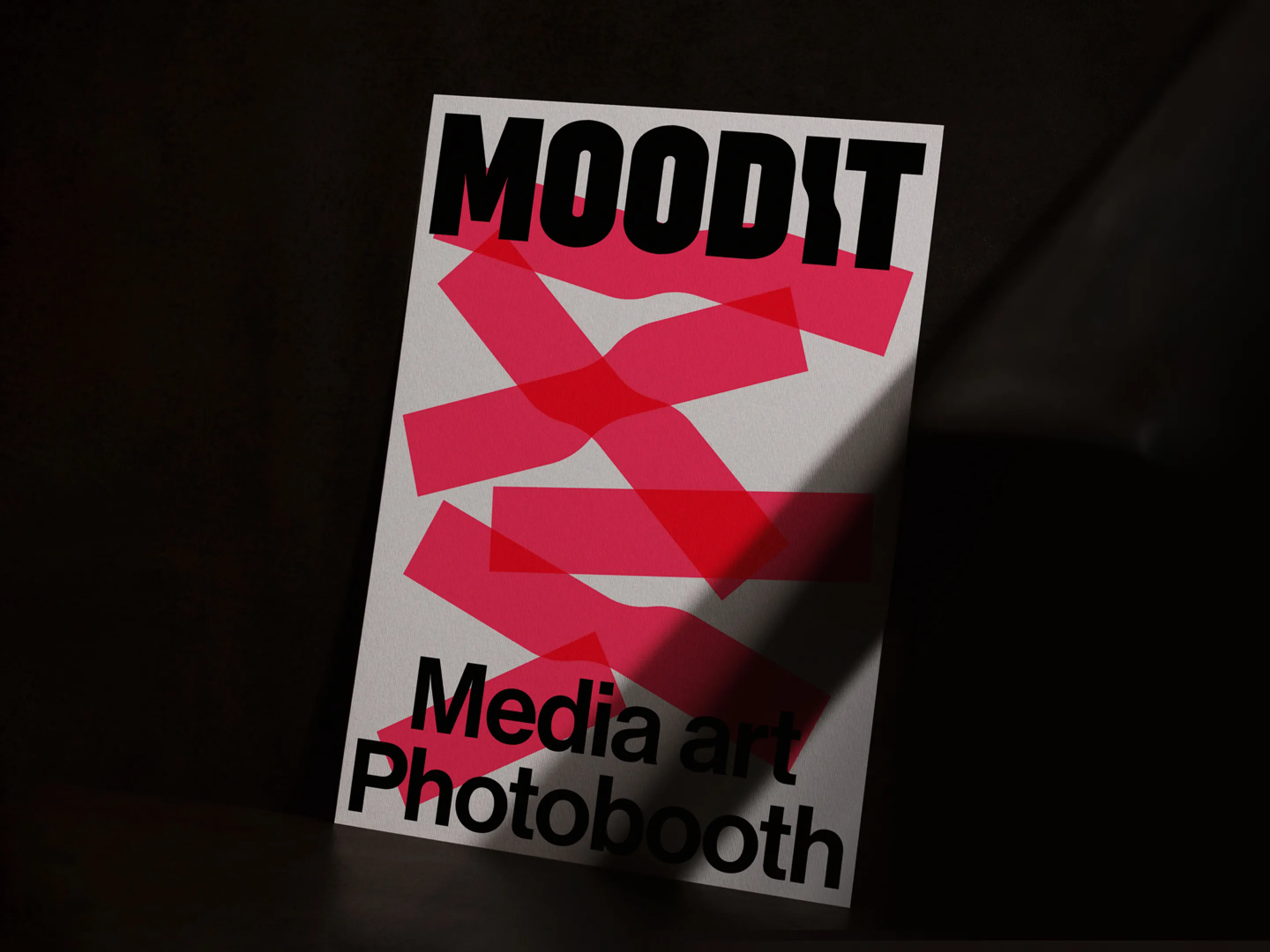
Moodit is a new form of photo booth brand that connects photobooths with media art. Through beam projectors, Moodit offers a differentiated experience from other photobooth brands by enabling various backgrounds, unreal and unique setups, and results that vary depending on poses. To secure brand competitiveness in the saturated photobooth market, mmpx defined Moodit's core brand values and essence, designed a consistent visual language encompassing the logo, application design, and overall brand, and built the brand identity. Analyzing the current status of the photobooth market and existing brands, we derived Moodit's unique story, defined the essence of the business and its core values. We determined that 'light' is Moodit's strong asset and established the brand direction of Moodit with the story of 'Creating a piece of art themed around 'me' using light.' Selecting one's own light, harmonizing light with oneself to freely express personal emotions and moods, and creating a piece of art themed around oneself is the distinctive customer experience of the Moodit brand. Moodit's brand colors stem from the prism symbolizing light, with vibrant magenta as the primary color and rainbow colors as accents. Starting with the basics of black and white representing states of darkness and encompassing all light, Moodit positions itself as a brand that embraces customers' individual moods and appearances, respects their personalities, and utilizes a color spectrum symbolizing various content moods.
-
무딧은 포토부스와 미디어아트를 연결한 새로운 형태의 포토부스 브랜드입니다. 무딧은 빔프로젝터를 통해 다양한 배경 뿐만 아니라, 비현실적이고 유니크한 연출이 가능하고, 포즈에 따라 시시각각 달라지는 결과물은 타 포토부스 브랜드와는 차별화된 경험을 제공합니다. mmpx는 포화된 포토부스 시장 내에서 브랜드 경쟁력을 확보하기 위해 무딧만의 브랜드 핵심가치와 업의 본질을 명확히 정의하고, 로고와 응용디자인 등 브랜드 전체를 아우르는 일관된 시각 언어를 설계하여 브랜드 아이덴티티를 구축하였습니다. 우리는 포토부스 시장의 현황과 현재 운영중인 타 브랜드를 분석하여 무딧만의 이야기를 도출하고업의 본질과 지향 가치를 설정하였습니다. ‘빛'이라는 소재는 무딧만이 지닌 강력한 자산이라 판단, ‘빛을 활용하여 ‘나’를 주제로 하나의 작품을 만들다.’ 라는 이야기로 무딧의 브랜드 방향성을 설정하였습니다. 나만의 빛을 셀렉하고, 빛과 내가 어우러져 나만의 감정과 분위기를 자유롭게 표현하는, 나를 주제로 하나의 아트를 만드는 공간은 브랜드 무딧의 차별화된 고객 경험입니다. 무딧의 브랜드 컬러는 빛을 상징하는 프리즘에서 출발하여 강렬하고 통통튀는 마젠타를 주조색으로, 무지개빛 컬러를 서브로 사용합니다. 어둠의 상태인 블랙과 모든 빛을 머금은 화이트를 기본으로, 다양한 무드의 컨텐츠를 상징하는 컬러 스펙트럼을 활용하여 고객 각각의 분위기와 모습을 포용하고 개성을 존중하는 브랜드로 자리매김합니다.